Making Tax Digital has never been made easier
Tax. Everybody has to pay it and – unfortunately – some of us have to file it, too. And, in a world so inundated with technology, it’s no surprise that HMRC is gearing towards completely digitising the UK tax system as part of their Making Tax Digital (MTD) initiative. In case you’re not so familiar, the fundamental goal of MTD – in sum – is to make it easier for businesses and individuals to ensure their tax affairs are in order. That’s not to say, however, that the transition has been easy.
Under MTD, businesses and individuals are obliged to use HMRC-compliant third-party software like Xero, Quickbooks or Sage to file their quarterly tax returns. Such an obligation, however, ultimately comes with its downfalls; for some, learning new systems and processes can be complex, time-consuming and – of course – expensive. Therefore, those who still want to use spreadsheets must use some form of bridging software that enables data transfer from within a spreadsheet to HMRC’s Government Gateway. Enter: 123sheets.

The challenge
The need for a design system
123sheets was founded by an entrepreneurial accountant, Peter Hamilton, in response to the MTD initiative to bridge the gap between bookkeeping and the HMRC filing system. Namely, 123sheets offers a solution for businesses and individuals who still want to record their tax returns using spreadsheets, such as VAT, Income Tax or Corporation Tax.
To support their pre-existing website, 123sheets decided they needed an app to take their product to the next level. After an in-house prototype was developed in .NET, the team realised the need to collaborate with a creative agency that would deliver professionalism, quality and cognisance in the design of the front-end interface of the product. That’s when they reached out to Lightflows.
Tailoring experiences for every user
Maximising the user experience
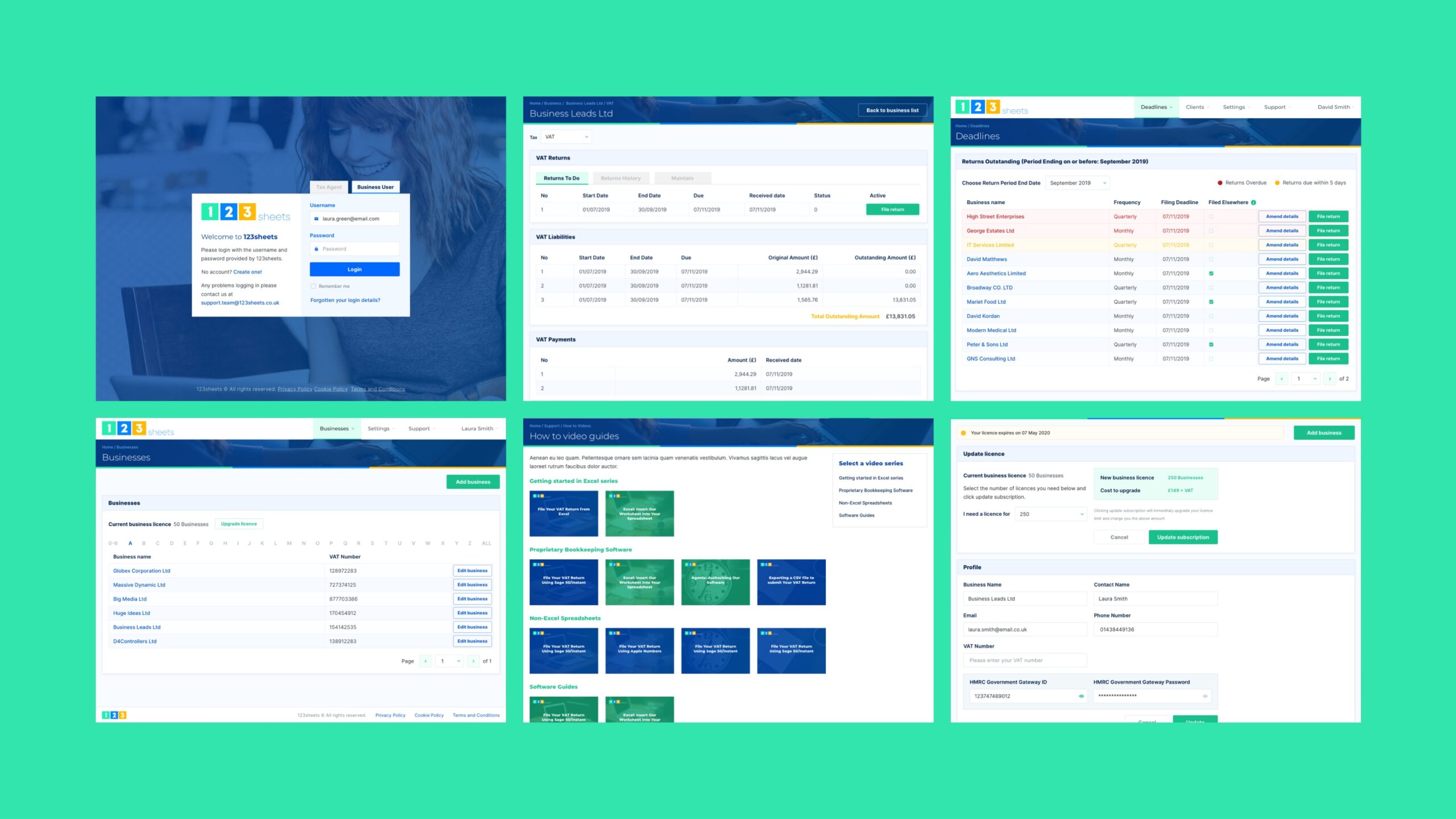
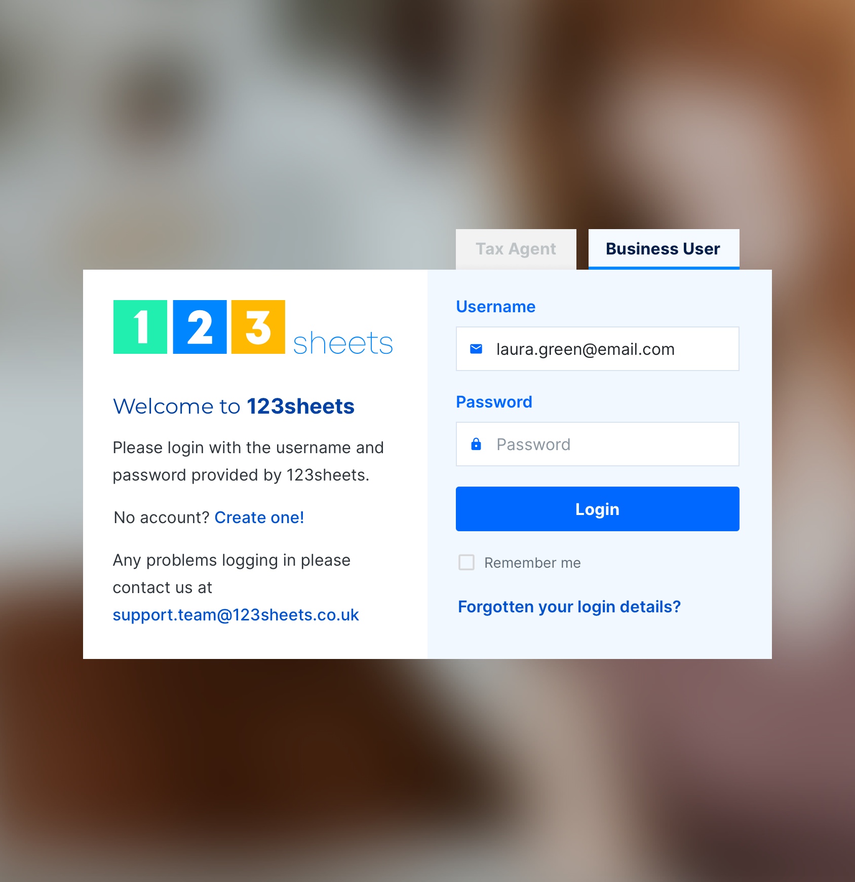
Typically, the 123sheets customer is either an agent – a bookkeeper or accountant who files numerous tax returns on behalf of their clients – or an individual looking to stay on top of personal tax. Therefore, in developing the various pages of the app, we decided to make the distinction between each customer clear from the onset, asking users to log in as either a Tax Agent or a Business User on the login screen to direct them to their individual needs.
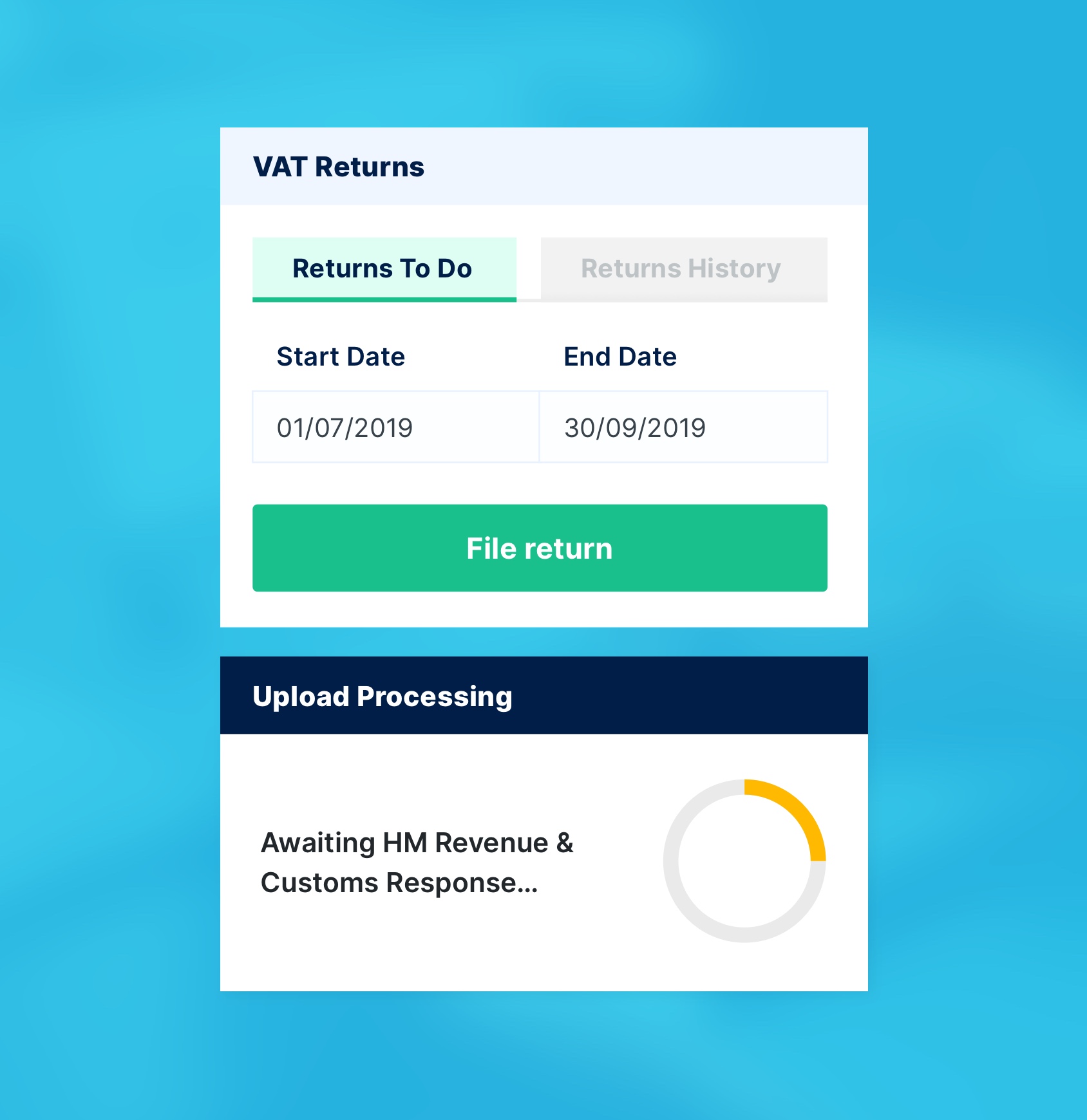
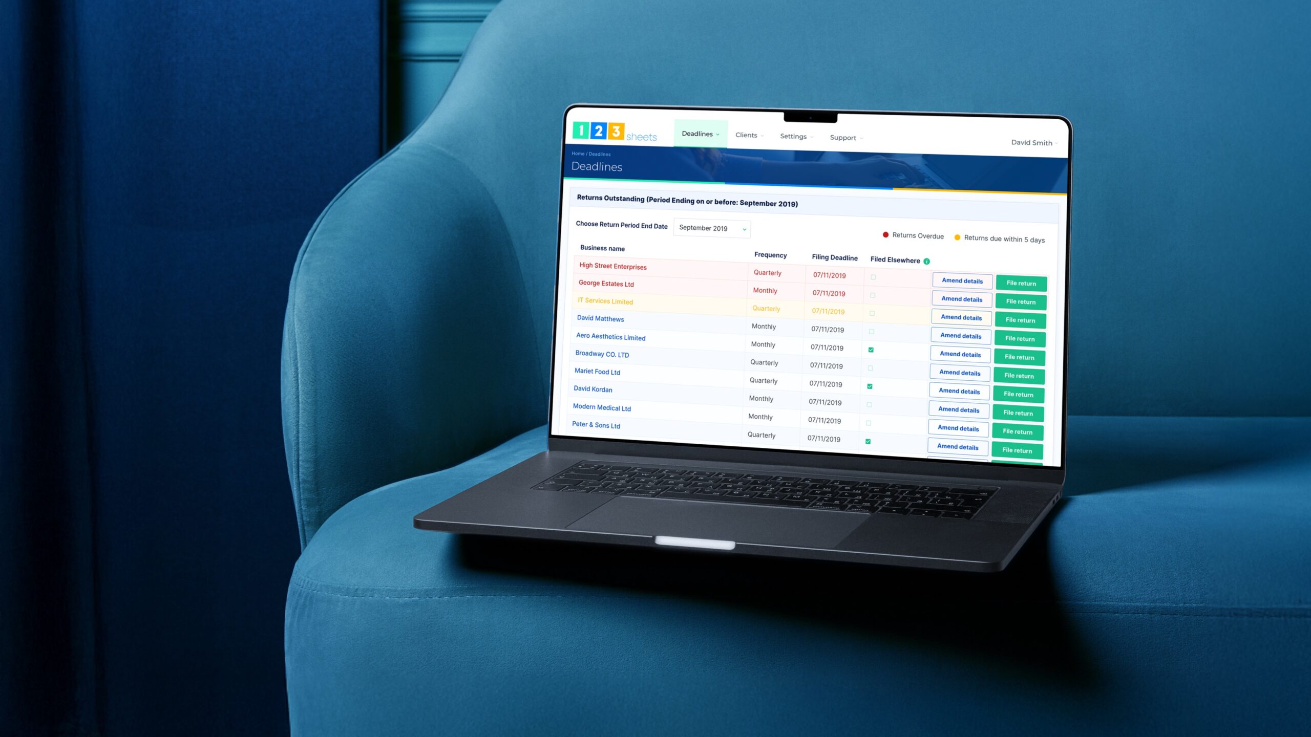
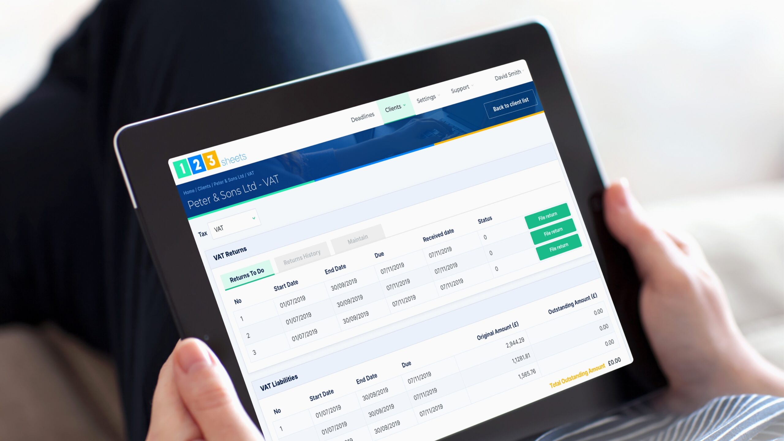
In mapping the user journeys, our design team was careful in selecting branding, colours and typography. A well-selected set of design principles is beneficial in many ways; it shapes brand identity, ensures consistency and promotes familiarity for the customer. Also, given that tax administration is a barrage of deadlines, the use of different – albeit few – colours throughout the app help differentiate upcoming, due and overdue returns, further facilitating the customer journey as they navigate through the app.

The solution
Collaborating with Lightflows
Here at Lightflows, we offer various technological solutions and consulting services with our clients on the best approach for their products. For those who do not have a particular tool in mind, this is especially useful as it allows them to gain an insight into our thinking about what is best for them. After collaborating via several workshops, meetings and discussions, and when our design team believe they have gathered enough information to develop the envisioned solution, they meticulously create the design prototype of the product in question. Then, once the design is signed off, our development team builds the front-end presentation of the product in a templating system they deem appropriate for the client’s needs, such as Laravel Blade or React.
Collaboration meets innovation
123 Sheets development team meets Lightflows
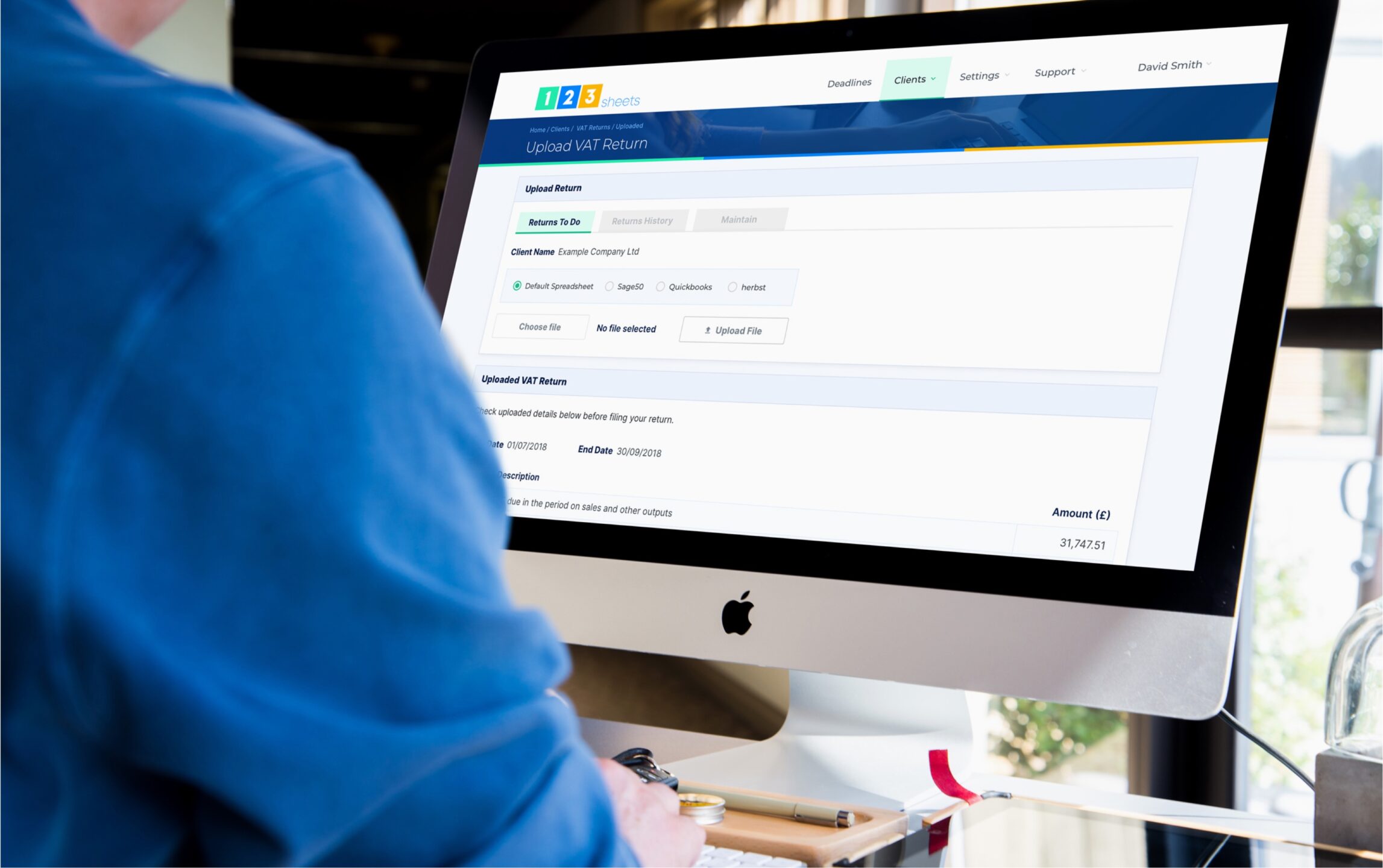
As the 123sheets development team already had technology in place, we collaborated with them by providing a component-based set of HTML templates using Sass, a CSS-compatible language, which could be used as a digital style guide for new pages and interfaces. This would act as a reference for the in-house team whenever they wanted to extend the project. We then undertook the templating of the app presentation pages in .NET, where their prototype was developed, too.


The results
Happy customers, happy client
The launch of the 123sheets app has resulted in very happy customers and an even happier client. The product is a prime example of entrepreneurial success, identifying a gap in the market and fulfilling it by creating software that satisfies the target consumer. Users of the application have left many testimonials sharing their experience, with the general sentiment surrounding ease of use, and Peter has kindly reflected on his experience as a client.
Delivering exceptional design and user experience
Conclusion
Matt and his team re-designed the front-end appearance of our ASP.NET website (123sheets) for users who have logged in. We were amazed with the final result; I personally think we would have struggled to find the same beauty anywhere else for a similar price – a big thank you to the whole team that worked with us to achieve this!
A triumph all round!
In need of a brilliant new website or app? Be sure to get in touch with Lightflows today to discuss how we can deliver the same excellence for your product.

